
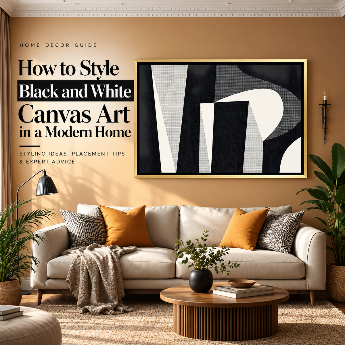
Black and white canvas art works best when you treat it as part of the room's contrast, not as something that automatically matches everything. A bold black-and-white abstract can anchor a pale living room, while softer monochrome line art can add detail without competing with colourful furniture or textiles.
The advantage of a monochrome palette is flexibility. Black and white artwork can work with warm beige interiors, cool grey rooms, white walls, dark feature walls and stronger colours. What changes is the amount of contrast, the subject, the frame and the scale of the artwork.
This guide explains how to style black and white art in a modern home, including which wall colours work best, how to stop a monochrome room from feeling cold, which frames to choose, where to hang the artwork and the mistakes that make black-and-white decor look flat.
Why does black and white art work so well in modern interiors?
Black and white artwork removes one of the most complicated parts of choosing wall art: matching several colours at once.
Instead, the visual impact comes primarily from:
- contrast
- shape
- line
- texture
- negative space
- the balance between light and dark areas
That makes monochrome artwork particularly compatible with modern interiors, where furniture and architecture often already use simple lines and controlled colour palettes.
But "black and white art" covers very different looks. A detailed cityscape, a minimal line drawing and a high-contrast abstract painting may use the same colours while creating completely different moods.
So start with the style of the artwork rather than assuming every monochrome canvas will suit the same room.
Choose the amount of contrast first
Before thinking about the wall colour, decide how strongly you want the artwork to stand out.
High-contrast black and white art
Artwork with large areas of deep black against bright white creates a strong focal point.
This works well when:
- the surrounding room is relatively simple
- the wall is large enough for a statement piece
- the furniture has clean shapes
- you want the artwork to be noticed immediately
Bold geometric art, expressive abstract work and graphic cityscapes fall into this category.
Soft monochrome art
Not all black-and-white artwork needs hard contrast.
Pieces that include grey, off-white, charcoal or fine line work create a softer effect. They are easier to use in bedrooms, smaller rooms and interiors that already contain several decorative elements.
Mostly white artwork with black details
This is a useful option when you want artwork without making the wall feel visually heavy.
Minimal faces, line drawings, architectural sketches and sparse geometric compositions can add structure while preserving plenty of visual breathing room.
Mostly black artwork with white details
Dark canvases have more visual weight.
They work best where the room has enough light and where the wall can support a stronger focal point. On a pale wall, a dark canvas can produce an almost architectural effect.
How to style black and white art on a white wall
A white wall creates the cleanest background for monochrome artwork, but it can also make the room feel unfinished if the artwork is too small or too faint.
For stronger impact, choose one of two approaches:
Use strong black contrast. A dark abstract, black-and-white cityscape or geometric piece creates a clear boundary against the wall.
Use subtle art but add a defined frame. If the artwork itself contains a lot of white, a black floater frame can stop it from disappearing into the wall.
Warm white and cool white walls also behave differently. Warm whites generally pair well with cream, beige and wood elsewhere in the room. Cooler whites work naturally with black, grey, metal and more architectural interiors.
If your main problem is specifically choosing artwork for a white or off-white wall, keep that as a separate decision from choosing monochrome art. The wall colour affects far more than black-and-white artwork alone.
How to style black and white art on beige and cream walls
Beige and cream walls are one of the easiest ways to make black-and-white decor feel warmer.
The black adds definition while the wall prevents the room from becoming overly stark.
For this combination, try:
- black-and-white abstract artwork above a cream sofa
- monochrome line art with natural wood furniture
- a black floater frame against warm beige
- black-and-white art with tan, brown or camel upholstery
If the room already contains warm metals or brass details, a gold floater frame can connect the monochrome artwork to those warmer finishes.
How to style black and white art on a grey wall
Grey walls create a more tonal monochrome scheme.
The main risk is losing definition, particularly when the artwork itself contains a lot of mid-grey.
On a light grey wall, artwork with a strong black element usually works better than a very pale grey composition.
On charcoal or dark grey, look for enough white or negative space in the artwork to create separation from the background.
If the entire room uses grey, black and white, introduce warmth elsewhere through wood, beige upholstery, warm lighting or textured fabrics. Otherwise, the combination can start to feel more commercial than residential.
Can black and white art work on coloured walls?
Yes. In fact, a coloured wall often makes monochrome artwork easier to style because the art is not competing with another colour palette.
The wall itself becomes the colour.
Green walls
Muted olive, sage and forest green can work particularly well with monochrome artwork.
Black introduces structure, while white prevents a deeper green wall from feeling too heavy.
Blue walls
Navy and deep blue create a strong background for black-and-white cityscapes, line art and geometric designs.
Against pale blue, softer monochrome compositions usually feel more balanced than extremely dark pieces.
Terracotta and rust walls
Warm earthy walls are a useful counterpoint to the cooler visual character of monochrome art.
A simple black-and-white abstract can look more inviting against terracotta than it would in a completely grey room.
Deep or dramatic feature walls
On black, charcoal, burgundy or other very dark walls, make sure the artwork contains enough white to remain visually separate from the wall.
A black-heavy canvas on a black wall can work, but it becomes a much subtler tonal effect rather than a conventional focal point.
Black and white art does not mean the entire room has to be monochrome
One of the easiest mistakes is to buy black-and-white artwork and then repeat black, white and grey across every object in the room.
You do not need to.
Monochrome art can act as the neutral element while colour comes from:
- a sofa or accent chair
- cushions
- a rug
- curtains
- plants
- wooden furniture
- ceramics
- one stronger accent colour
For example, a black-and-white abstract canvas above an olive sofa can feel more considered than the same artwork above a grey sofa surrounded by grey accessories.
How to add warmth to black and white decor
If a room with monochrome artwork feels cold, changing the artwork is not always necessary.
Add warmth through the materials around it.
Use natural wood
Oak, walnut and other warm wood tones soften the hard contrast between black and white.
A wooden console below monochrome artwork is often enough to make the wall feel more residential.
Add textured fabrics
Linen, boucle, wool and woven textiles introduce softness that flat monochrome surfaces cannot provide on their own.
Bring in plants
Greenery adds colour without changing the overall neutral character of the room.
It works especially well with black-and-white botanical, architectural and abstract artwork.
Use warm lighting
Lighting changes the way white areas of the canvas and surrounding walls appear.
Warm ambient lighting can make a black-and-white room feel considerably softer in the evening.
Introduce one controlled accent colour
You do not need several colours.
Rust, olive, deep blue, burgundy or mustard used in small amounts can break up a monochrome scheme without distracting from the artwork.
Which style of black and white art should you choose?
Abstract black and white art
Abstract artwork works well when you want visual movement without introducing a specific subject.
It is particularly useful above sofas, dining consoles and in open-plan living spaces.
If abstract art is your main interest, browse the wider Abstract Wall Art collection or read our guide to choosing abstract paintings for a living room.
Geometric black and white art
Geometric artwork introduces more structure.
Grids, blocks, lines and repeated forms fit particularly well with modern furniture, architectural interiors and offices.
Minimal line art
Line art is a better fit when you want the wall to feel finished without creating a dominant focal point.
It suits bedrooms, reading areas, smaller living rooms and spaces with sculptural furniture or stronger textiles.
Black and white cityscape art
Architecture and city views have a more specific identity than abstract artwork.
They suit urban, modern and industrial interiors particularly well and can work in living rooms, offices, hallways and studies.
Black and white photography-style canvas art
Monochrome photographic imagery can work with contemporary interiors, but keep the subject aligned with the room. Architecture, landscape and artistic portraits each create a very different atmosphere.
How to match black and white wall art with furniture
The artwork does not have to match the furniture colour exactly.
Instead, look for repetition of either contrast, shape or material.
With a white or cream sofa
Use stronger black elements in the artwork so the wall does not become too pale.
A black floater frame can help define the canvas further.
With a grey sofa
Choose either higher contrast artwork or introduce warmth elsewhere through cushions, wood and lighting.
With a black sofa
A canvas with more white or negative space usually gives the composition better separation.
Too much black across the sofa, frame and artwork can make the entire wall feel visually dense.
With brown or tan furniture
Monochrome artwork works particularly well because the warm upholstery balances its cooler palette.
This is also a good setting for a gold floater frame if other warm metallic finishes already appear in the room.
With colourful furniture
Black-and-white art can act as a visual pause.
Instead of trying to match the artwork to a blue, green or rust sofa, let the furniture provide the colour and keep the wall art deliberately neutral.
Which frame works best with black and white canvas art?
Frame choice can change the character of monochrome artwork considerably.
Black floater frame
A black frame creates the strongest definition and is usually the safest choice for modern monochrome artwork.
It works particularly well on white, beige and lighter coloured walls.
Gold floater frame
Gold adds warmth and creates more separation between the artwork and a purely minimalist aesthetic.
It works best when the room already contains warm wood, brass, beige or gold-toned details.
Canvas wrapped
A canvas-wrapped finish keeps the artwork visually simpler and removes another hard outline from the composition.
This can work particularly well with large abstract designs or in rooms where the artwork already has strong black areas.
Cipher Spaces offers canvas-wrapped, black floater and gold floater options across many of its modern and abstract designs.
How big should black and white wall art be?
The colour palette does not change the basic sizing rule: the artwork still needs enough scale for the wall and the furniture beneath it.
A detailed monochrome piece can look impressive online and still feel insignificant if it is too small above a wide sofa.
Think about:
- the width of the furniture below it
- the available wall width
- whether the canvas is portrait, square or landscape
- how much empty wall you want around the artwork
- whether it is a single canvas or part of a larger arrangement
For detailed measurements, use our canvas size guide rather than choosing a size only from the product image.
Where should you place black and white canvas art?
Above the sofa
This is one of the best locations for a large monochrome statement piece because the sofa gives the artwork a clear visual anchor.
Landscape compositions generally suit wider sofas better than narrow portrait canvases.
Above the bed
Choose softer abstracts, line art or compositions with more negative space if you want the bedroom to remain visually calm.
Extremely high-contrast graphic artwork creates a more dramatic bedroom.
Dining room
Black-and-white art can make a dining space feel more structured, particularly when the table, chairs or lighting already contain dark details.
Geometric, abstract and architectural artwork are particularly easy to use here.
Home office
Monochrome artwork works well in offices because it can add visual interest without introducing several competing colours.
Cityscapes, geometric pieces and restrained abstract compositions suit this setting particularly well.
Hallway or console wall
A monochrome canvas above a console can create a strong transition area between rooms.
Use lamps, ceramics, books or plants below it to keep the arrangement from feeling too flat.
One large canvas or several black and white artworks?
Choose one large canvas when you want a clear focal point and the wall already has strong furniture beneath it.
Multiple artworks make more sense when:
- the wall is unusually wide
- you want to mix line art, abstract and architectural subjects
- the furniture arrangement is asymmetrical
- you intentionally want a collected gallery effect
If you create a group, keep at least one visual element consistent. That could be the colour palette, frame finish, subject family or spacing.
Do not create a gallery wall simply because you have several empty spaces to fill. One properly scaled canvas often looks cleaner in a modern interior.
Common black and white decor mistakes
Making everything black, white and grey
Monochrome art does not require a completely monochrome room.
Without warm materials, plants, textiles or another colour, the interior can start to feel flat.
Choosing art that is too small
Strong black-and-white contrast makes the boundaries of the artwork especially obvious.
If the canvas is undersized, the empty wall around it becomes even more noticeable.
Ignoring undertones in the room
White walls can be warm or cool. Grey can lean blue, green or beige. Black-and-white artwork is neutral, but the surrounding room often is not.
Consider those undertones when choosing the frame and other accessories.
Using too many graphic patterns
A bold geometric canvas, striped rug, patterned cushions and graphic curtains can compete with each other even when they share the same colours.
Choose where you want the strongest pattern to live.
Using a heavy black frame on already dark artwork
This can work intentionally, but it adds visual weight.
If the canvas is predominantly black and the room is small, canvas wrap or a contrasting frame may create a lighter result.
Trying to match every object
A modern room usually looks more natural when elements relate to each other without being identical.
Your artwork does not need to reproduce the exact pattern of the rug or the exact colour distribution of the sofa.
How to style black and white art in a modern living room
A simple approach is to build the wall in this order:
- Choose the focal wall.
- Measure the furniture underneath it.
- Decide whether you want high or soft contrast.
- Choose abstract, geometric, line or representational art.
- Select the frame based on the surrounding materials.
- Add warmth through furniture, textiles, plants or lighting.
For example, a cream sofa, walnut coffee table and beige rug can support a bold black-and-white abstract without making the room feel cold.
In a more architectural space with grey furniture and metal details, a monochrome geometric or cityscape canvas can reinforce the cleaner look. In that case, introduce warmth through lighting or one natural material rather than adding several new colours.
Frequently asked questions about black and white wall art
Does black and white art go with everything?
Black and white art is highly flexible, but it does not automatically suit every room. The subject, amount of contrast, size and frame still need to work with the furniture, wall colour and overall style.
What wall colour looks best with black and white art?
White, beige, cream, grey, muted green, blue and many deeper feature-wall colours can all work. The best choice depends on whether you want the artwork to create strong contrast or blend more quietly into the room.
Does black and white art work on beige walls?
Yes. Beige is particularly useful because it adds warmth to the black-and-white palette. Black frames, natural wood and cream upholstery work naturally with this combination.
Can I put black and white art on a dark wall?
Yes. Choose artwork with enough white or lighter areas to separate it from the wall. A black-heavy canvas on charcoal or black will create a subtler tonal effect.
What colours go with black and white wall art?
Because the artwork itself is neutral, you can introduce colour through furniture and accessories. Olive green, rust, burgundy, navy, tan, mustard and natural wood tones are all practical options depending on the room.
Should black and white art have a black frame?
Not necessarily. A black floater frame gives the strongest definition, while gold adds warmth. Canvas wrap works when you want a simpler edge or the artwork already has strong contrast.
Is black and white art good for a bedroom?
Yes. Softer monochrome abstracts, line drawings and compositions with more white space are particularly easy to use in bedrooms. Very dark or highly graphic pieces create a stronger, more dramatic mood.
Is black and white art suitable for a living room?
Yes. Living rooms are particularly suitable because they usually have enough wall area for larger monochrome artwork. Abstract, geometric, cityscape and minimal designs can all work depending on the interior.
Can black and white art work with colourful furniture?
Yes. This is often one of its strongest uses. The artwork provides a neutral visual anchor while the sofa, rug, chairs or cushions provide colour.
Is black and white art only for minimalist homes?
No. Monochrome art can also work in contemporary, industrial, eclectic and more decorative interiors. The subject and framing determine whether the result feels minimal.
Shop black and white canvas art for modern interiors
Black and white wall art is easiest to style when you choose the contrast and subject for the room rather than buying purely because the colours seem neutral.
Use a bold abstract or geometric piece when the wall needs a focal point, softer line art when the room already has visual detail, or an architectural design when you want a cleaner urban character.
Then use the room around it to supply warmth, texture and colour.
Browse the Abstract Wall Art collection and Modern Wall Art collection to find monochrome and neutral canvas designs for living rooms, bedrooms, offices and other contemporary spaces.